Subjects -
A Designer (choose from list)
An Architect (choose from list)
An Artist (choose from list)
Style (choose from list)
Craft (choose from list)
Person (choose from list)
History (choose from list)
Rules of Construction -
Pure white (shadow/relief only)
Surface texture
Words only (type/hand lettering)
Die Cutting/Drilling/Hole Punching
Transparency/Opacity
Repetition/Pattern
Complementary colours
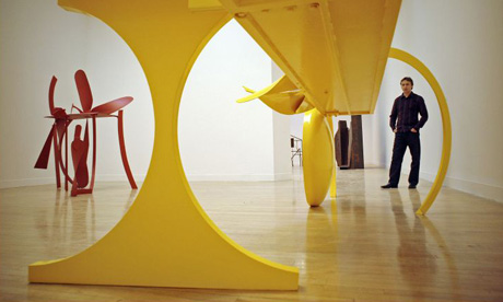
I have also been asked to fully research two of the following subjects of my choice that I will be incorporating with a rule to my cubes. I chose an Artist named Anthony Caro who is viewed as Britain s greatest sculptor. His art is of making sculptures out of steel, one of his first steel sculptures made was a parallelogram, square and a circle welded together and called simply, Twenty-four hours. Since then, he explored the world of steel, steel detritus, industrial off-cut with his work being in public and private collections all over the world. Below is a more in-depth research sheet that will be accompanying my cubes.
http://www.royalacademy.org.uk/academicians/sculptors/anthony-caro,61,AR.html
+047.JPG)


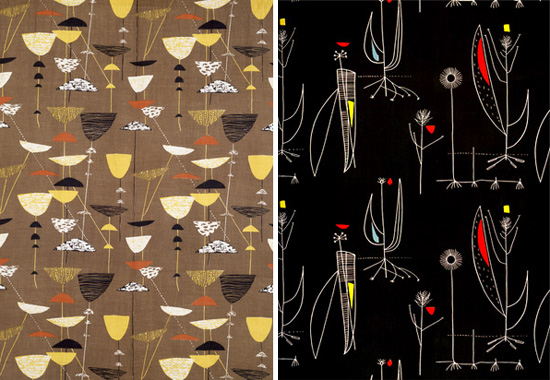
My second subject I have chosen is a designer called Lucienne Day. Her 60 year career has seen freshness and originality and is still relevant to contemporary interiors today. She has a versatile and influential designer, she was commissioned by a wide range of companies which extended her very particular vision to carpets, wallpapers, tea towels and ceramics as well as textiles. Below is a more in-depth research sheet that will be accompanying my 3D cube for Lucienne Day.
http://www.classictextiles.com/pages/index.cfm/lucienne-day/
A Designer (choose from list)
An Architect (choose from list)
An Artist (choose from list)
Style (choose from list)
Craft (choose from list)
Person (choose from list)
History (choose from list)
Rules of Construction -
Pure white (shadow/relief only)
Surface texture
Words only (type/hand lettering)
Die Cutting/Drilling/Hole Punching
Transparency/Opacity
Repetition/Pattern
Complementary colours
I have also been asked to fully research two of the following subjects of my choice that I will be incorporating with a rule to my cubes. I chose an Artist named Anthony Caro who is viewed as Britain s greatest sculptor. His art is of making sculptures out of steel, one of his first steel sculptures made was a parallelogram, square and a circle welded together and called simply, Twenty-four hours. Since then, he explored the world of steel, steel detritus, industrial off-cut with his work being in public and private collections all over the world. Below is a more in-depth research sheet that will be accompanying my cubes.
http://www.royalacademy.org.uk/academicians/sculptors/anthony-caro,61,AR.html

My second subject I have chosen is a designer called Lucienne Day. Her 60 year career has seen freshness and originality and is still relevant to contemporary interiors today. She has a versatile and influential designer, she was commissioned by a wide range of companies which extended her very particular vision to carpets, wallpapers, tea towels and ceramics as well as textiles. Below is a more in-depth research sheet that will be accompanying my 3D cube for Lucienne Day.
http://www.classictextiles.com/pages/index.cfm/lucienne-day/
+049.JPG)