Monday 14 May 2012

One square, one circle

Brilliant thinking, makes me want to try some of my own with using ONLY two shapes, hmm maybe?


Wednesday 9 May 2012

Updating blog...

Within the next couple of days I will be uploading all my research and resources files that I have been collecting throughout my first year at University. I haven't put them online yet, they are hiding away in a large folder that I will be sorting out.

Researching my subjects (cubes)

For my next project we have been asked to create eight 80x80mm cubes, seven of which are to be created in response to a given selection of subjects with incorporating one of the rules of construction that are given along side. And the other to be pure solid white. Check out the choices below.

Subjects -
A Designer (choose from list)
An Architect (choose from list)
An Artist (choose from list)
Style (choose from list)
Craft (choose from list)
Person (choose from list)
History (choose from list)

Rules of Construction -
Pure white (shadow/relief only)
Surface texture
Words only (type/hand lettering)
Die Cutting/Drilling/Hole Punching
Transparency/Opacity
Repetition/Pattern
Complementary colours

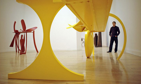
I have also been asked to fully research two of the following subjects of my choice that I will be incorporating with a rule to my cubes. I chose an Artist named Anthony Caro who is viewed as Britain s greatest sculptor. His art is of making sculptures out of steel, one of his first steel sculptures made was a parallelogram, square and a circle welded together and called simply, Twenty-four hours. Since then, he explored the world of steel, steel detritus, industrial off-cut with his work being in public and private collections all over the world. Below is a more in-depth research sheet that will be accompanying my cubes.

http://www.royalacademy.org.uk/academicians/sculptors/anthony-caro,61,AR.html


My second subject I have chosen is a designer called Lucienne Day. Her 60 year career has seen freshness and originality and is still relevant to contemporary interiors today. She has a versatile and influential designer, she was commissioned by a wide range of companies which extended her very particular vision to carpets, wallpapers, tea towels and ceramics as well as textiles. Below is a more in-depth research sheet that will be accompanying my 3D cube for Lucienne Day.

http://www.classictextiles.com/pages/index.cfm/lucienne-day/


Moving Type - In colour (1B)

Grade - 62

For this project we had to produce a minimum of ten 12x18cm final pieces using no more than six letterforms, like my previous project but with the freedom to add colour and motion. We were asked to design storyboards of 10 seconds long that consist of the moving image in colour that we will later be creating digitally using Adobe After Effects (see future post). We must use the letterforms (actors) and the subject of our film must be of a creative response and treatment to given subjects such as Calm to Stormy, Day to Night and Strong to Weak, which must all be portrayed using colour and motion effectively giving their characteristics. Look at my pieces below that show my initial storyboarding ideas and the final outcome which I will be later developing into a digital format.

One of my triumphs for this brief were that I started off quickly, brainstorming ideas down as fast as I could which proved to be helpful as more and more ideas kept coming. I found this way of working successful. My mistakes were that I did not experiment with enough colour media which limited my potential.


Introduction to Kinetic Typography

Referring to my current project based on colour and the journey of no more than six letterforms, after the brief we will be soon looking into making the ten 12x18cm final pieces of our journeys into a 10 second moving image with the use of typography. I have been looking on the internet for related videos that are called 'Kinetic Typography' that refers to moving text that use colour and typography as a tool of communication. In the video you will notice some pieces of text have been altered in such a way that matches the characteristics of the type.


Use of colour as a tool of communication

I have been asked to choose two designers or illustrators and explore their use of colour as a tool of communication. Given that I appreciate and share a design love for Abram Games I will use one of his that I believe is his personal best.

I feel that he has used colour greatly in this piece. He has clearly and objectively stated 'your own' to be an important part of the poster, making it a cheerful selection, suggesting that this should be done positively with a touch of fun. Adding the white fading colours into the blue sky makes the main image more noticeable and also gains attention straight away. Most of the other colours suggest basic understanding of the necessary colours that are needed for the objects and nothing looks out of place. I love the way he has identified the grass and the sea, he has done this beautifully.


I love the use of colour used in this piece by Brad Holland, it shows beautiful understanding of shadow, highlights and maybe realism? I also love the mysterious looking sky that are touched with drops of purple to give it that kick. I just love it, not as an Illustrator, but as a Graphic Designer.


Colour meanings and theory

I was researching on the internet for my new 'colour' project and I came across a very useful source of information when relating to colour as a tool of communication. I have been told that colour can 'make or break' a piece of design and the right choice is vital. I feel it is important to know which colour shouts what at the viewer. Take a look below.

Red - evokes aggressiveness, passion, strength and vitality
Pink - evokes femininity, innocence, softness and health.
Orange - evokes fun, cheeriness and warm exuberance.
Yellow - evokes positivity, sunshine and cowardice.
Green - evokes tranquility, health and freshness.
Blue - evokes authority, dignity, security and faithfulness.
Purple - evokes sophistication, spirituality, costliness, royalty and mystery.
Brown - evokes utility, earthiness, woodsy-ness and subtle richness.
White - evokes purity, truthfulness, being contemporary and refined.
Gray - evokes somberness, authority, practicality and a corporate mentality.
Black - evokes seriousness, distinctiveness, boldness and being classic.

Marks on Paper - Black & White (1A)

Grade - 55

For this project brief we had to create a minimum of eight A6 finals that were created only using black and white materials (grey). We were given eight different subjects to look at such as Medieval Torturer and Driving Instructor and we had to identify each of the character attributes, then using only our names we had to manipulate our names so that they shared some relation/sensitivity to the unique characteristics of each subject. Look at some of my development sheets below that show me experimenting with the possibilities.

One of my triumphs for this brief were that I started off quickly, brainstorming ideas down as fast as I could which proved to be helpful as more and more ideas kept coming. I found this way of working successful. My mistakes were that I did not experiment with enough media which limited my potential.


Monday 7 May 2012

How POWERFUL can a typeface be to communicate more than words?

I have been looking at some typeface examples on the internet, but I wanted to find a basic example to explore the power of typefaces to communicate more than words.

The image below, shows a single large and bold word that is set in lowercase and closely kerned. The typeface has been positioned to look loud and dominant with a message that suggests confidence or a friendly greeting. This greeting would be recognized as enthusiastic, that the person is pleased to see you.


However, the second image brings forward a completely different contrast. Exactly the same text has been used as a greeting. But the color, scale, font, case and positioning have all changed and further suggest a less enthusiastic greeting, more hesitant. The person greeting here is most definitely not ackknowledging you and are more inclined to ignore


I have given the most basic of examples above but it shows a solid understanding of the power of typefaces and how changes can influence heavily on the message or the language. I guess typefaces are going to be much more advanced than i first though, I am very interested in Typography and see it as a passion. Both of these examples show that there is an infinite range of typographic alternatives that can achieve subtle or dramatic changes in volume, tone of voice, gender and age groups. I look forward to exploring them.

Thursday 29 March 2012

Blog & Website revamp.

Hi, recently I have been busy updating my blog & portfolio website. Fortunately I have kept all my old posts, so in a few days I will get round to re-posting, I hope you like the new look.


Check out my website.